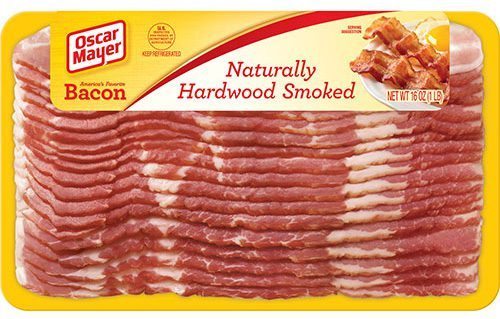
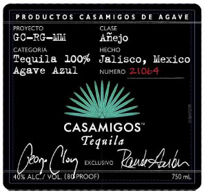
After a full day wrangling booze labels, I heard a good story about bacon labeling on the way home from work (bringing home the bacon, as it were). The radio story emanated from a Bloomberg web story, “Why Supermarket Bacon Hides Its Glorious Fat.” The story touches upon the intersection of our love-hate relationship with fat and with government, and also upon labeling issues and wily businesspeople. Explaining that bacon has “one of the most unusual and underappreciated packaging formats of any supermarket product” it says:
The standard one-pound package shows the bacon slices fanned out, with only their leading edges exposed. The industry term for this is a shingle pack—a reference to the way the slices overlap. Because those front edges tend to feature more lean muscle than the fattier back edges, and because the face of the top slice is invariably covered by a paperboard flap containing the manufacturer’s logo and other branding information, the consumer sees a relatively unbroken field of red protein, creating the illusion that the bacon is leaner than it is.
Lest the bacon packaging hide the fat too much, the U.S. government requires the packaging to show the real story, at least on the back window. The window allows the consumer:
Continue Reading Leave a Commentto see how the bacon...


