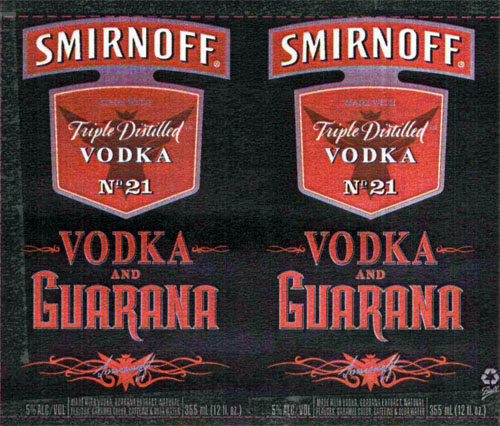
TTB often says the term “vodka” may not appear, in a prominent manner, unless: the product is simple vodka, or qualifying language surrounds the term, in the same font. An example is VODKA WITH NATURAL FLAVOR, where TTB would not usually allow VODKA to be more prominent than WITH NATURAL FLAVOR.
The product above is not plain vodka, and yet the term “vodka” appears in a surprisingly emphasized manner. It is emphasized by being large (about five times the size of the actual statement of composition). It is emphasized by repetition (no less than six appearances). It is also emphasized to the extent that “Smirnoff” is or was synonymous with “vodka.” The true statement of composition is hard to read on this scan and says: “MADE WITH VODKA, GUARANA EXTRACT, NATURAL FLAVORS, CARAMEL COLOR, CAFFEINE & SODA WATER.” The other color is off to the side.
TTB has underscored this vodka rule by asserting, on other approvals for this brand: “When new labels are printed, the word ‘vodka’ cannot appear more prominent nor stand alone. [Vodka & Guarana] must appear together and in the same size type print/font.” TTB felt strongly enough to allow it with all of the following restrictions: Arizona sales only, test marketing only, 23,000 cases only, and six months only. Curiously, TTB also said “When new labels are printed, all references to ‘soda’ must be removed.” TTB appears to be concerned that an errant minor could mistake the above (or other alcohol beverages bearing the term “soda”) for a soft drink.
Please choose a language.
Choose
Sign Up For Email Updates
Submit your e-mail address to receive new blog posts (Bevlog Beverage Law Blog) and occasional news items – with no spam.Latest Posts
Bevlog & Articles
Jan02
Posted In:
New Year’s Resolution – Industry Compliance
At this time of year, gym memberships soar, subscriptions to healthy recipe apps fly off the digital shelves, and personal...Read More
Jul12
Posted In:
Federal District Court Declares Federal Ban on At-Home Distilling Unconstitutional
On July 10th, 2024, the Northern District Court of Texas issued an order in Hobby Distillers Association, et al., v....Read More
Nov05
Posted In:

Leave a Reply