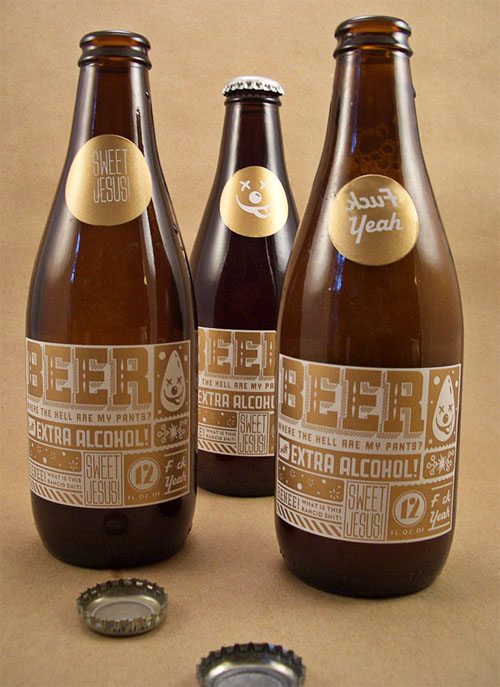
Here is an experimental beer label, sent in from one of our favorite label designers. It is from Dave Bourne of Ignite Design in Portland, Oregon. Dave saw it at The Dieline and commented as follows:
You don’t need beer goggles to fall in love with this label design. Beyond the irreverent text and what seems to be their logo of an inebriated beer droplet, there is a design aesthetic that easily combines all the random graphic elements together as a cohesive unit. Who knew you could use no less than seven different typefaces and make them all work together in unison? It helps that all the graphics are gold on a simple off-white paper stock. Also, the placement of every design element fits within a grid-like structure that allows you to look at each component of the design within its own square or rectangular space.
While you’re throwing back a few of these, it’s clear that you won’t be bored with ubiquitous “Don’t drink and drive” statements or graphics of the various kinds of hops they’ve used. Instead, you’ll enjoy a little lesson in beer chemistry along with a few fireworks and an exclamation of “SWEET JESUS” possibly reminding you to pray for more of this beer when it runs out.
We blurred up some of the swear words, and you can see the unexpurgated version at the link. I like this design and would not resist buying the beer or drinking it, but I think Dave likes it more than I do. Where are the other great beer label designs and designers? What makes them great?


It’s an entertaining and fantastic-looking label, but would it have any hope of getting approved? Aside from the lack of brand name, the TTB might take issue with the “Extra Alcohol!”
Well I can say we’ve never seen a label like that. Very creative with a great sense of humor. It will be interesting to see if that design or a similar one will get adopted.
Cheers DIA
@drinkinginamerica
http://bit.ly/drinkinginamerica
I agree with Nathan…I don’t think that the TTB would approve the “Extra Alcohol”