


Posted In:
This post will start short but is likely to grow long over time. Very long. We will try to show the enormous range of foodstuffs from which wine is produced. With each post we will add to the list, and I predict it will grow way past 50 60. Today we add Cranberry wine to the list.
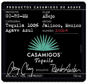
- Agave wine
- Apple wine
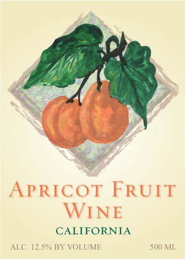
- Apricot wine
- Aronia berry wine
- Avocado wine
- Banana wine
- Blackberry wine
- Blueberry wine
- Buffaloberry wine
- Cantaloupe wine
- Cherry wine
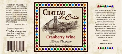
- Cranberry wine. Made by Horton Vineyards of Gordonsville, Virginia.
- Dandelion wine
- Elder flower wine
- Fig wine
- Gooseberry wine
- Grape wine
- Jasmine fruit wine
- Kiwi wine
- Linden flower wine
- Lingonberry
- Lychee wine
- Mango wine
- Mangosteen wine
- Marionberry wine
- Onion wine
- Peach wine
- Pomegranate wine
- Pear wine
- Pepper wine
- Persimmon wine
- Pineapple wine
- Rhubarb wine
- Strawberry wine
- Tomato wine
- Watermelon wine