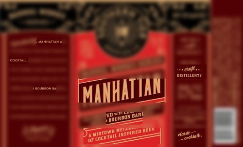
A beer with a reference to: DISTILLERY, COCKTAILS, BOURBON, and a MANHATTAN?
Yes.

A beer with a reference to: DISTILLERY, COCKTAILS, BOURBON, and a MANHATTAN?
Yes.
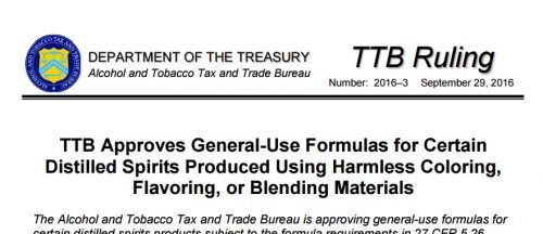
TTB put out Ruling 2016-3 at the end of September. It relates to spirits formula approvals, and is intended to cut some of the burdens for spirits companies and for TTB. It’s also sort of long. Word says it is 3,573 (carefully chosen) words. My mission is to break it down to 15% or less.
The gist is, TTB will help you avoid formula approval for many products in these big categories: vodka, rum, whisky, brandy. Some details, on each category, are below. If you want the whole story, you can go to the Ruling, and the elaborations at Industry Circular 2016-1 (for imports) and Guidance 2016-3. Rather than knocking out the formula approval requirements in the spirits regulations, TTB explains: “TTB will not accept for review new formulas submitted for products approved under this ruling. This ruling serves as the approval that is required by §§ 5.26, 5.27, and 19.348.”
TTB does reserve the right to look into this further, as needed, on a case-by-case basis. The Ruling “provides immediate relief from the formula submission requirements for these specific products.”
TTB took a similar action with respect to malt beverage formulas about two years ago. This must have helped, because TTB later expanded this to other malt beverage products. TTB has also, at the end of September, expanded this approach, to wine. We have covered the beer issues in the past, we are covering spirits here, and may cover the wine issues in the future. I am guessing Ruling 2016-3 cuts several hundred formulas per year. LabelVision says TTB approved 748 vodkas in the most recent year (this is a count of label approvals, for unique brand names, on products coded as vodka, since most formula data is not public). A svelte 446 words.
After a full day wrangling booze labels, I heard a good story about bacon labeling on the way home from work (bringing home the bacon, as it were). The radio story emanated from a Bloomberg web story, “Why Supermarket Bacon Hides Its Glorious Fat.” The story touches upon the intersection of our love-hate relationship with fat and with government, and also upon labeling issues and wily businesspeople. Explaining that bacon has “one of the most unusual and underappreciated packaging formats of any supermarket product” it says:
The standard one-pound package shows the bacon slices fanned out, with only their leading edges exposed. The industry term for this is a shingle pack—a reference to the way the slices overlap. Because those front edges tend to feature more lean muscle than the fattier back edges, and because the face of the top slice is invariably covered by a paperboard flap containing the manufacturer’s logo and other branding information, the consumer sees a relatively unbroken field of red protein, creating the illusion that the bacon is leaner than it is.
Lest the bacon packaging hide the fat too much, the U.S. government requires the packaging to show the real story, at least on the back window. The window allows the consumer:
to see how the bacon truly looks in all its fatty glory. … [T]he shingle pack doesn’t just present an idealized bacon fantasy—it also provides a built-in reality check. It’s hard to think of another package that engages in such a clever sleight of hand on the front and then gives away the game on the back.
The story also has a nifty video about the machinery used to slice the bacon slabs optimally. In a radio version of the story, Lukas says the shingle pack is “ingeniously deceptive.”
And if you don’t think bacon shingles have a lot to do with booze marketing, you should take a peek through this window.
TTB’s website at www.ttb.gov can be pretty helpful. Here are a few of the pages we check most often.
We could go on. But we are not sure you want us to. If you know of other great pages, within or without ttb.gov, let us know.
For a good, edifying time, grab a bottle of craft spirits, a beach — and this book.
The book is Moonshiner to Craft Distillery: Leading Lawyers on the Business of Distilling. Aspatore Books, a division of Thomson Reuters, published the book a few weeks ago. In this book, I am pleased to be in the good company of Ryan Malkin, Gloria Materre, Alva Mather, and other notable lawyers in the alcohol beverage law field.
Here are a few excerpts from my chapter, entitled “Reflections on Thirty Years of Spirits Law Practice: From a Few Score to a Few Thousand Distilleries.”
Almost thirty years ago I got lucky and happened upon the hitherto unknown field (unknown at least to me) now known as beverage law. The years have passed quickly, and this is a testament to how challenging and interesting this field can be. Things have moved a long way during that time, from shuffling paper forms, digging through millions of words in black binders, and a country with a few dozen large distilleries. The law has not changed a lot, but the related law practice has changed dramatically, and so has the business climate.
This area of the law is more heavily regulated than any other aspect of consumer products law — more than guns, tobacco, or even pharmaceuticals. What other consumer product is the focus of not just one, but two, Constitutional amendments? Tobacco and marijuana do not rate even one. Thus, in looking at what laws apply most directly to moonshining and proper distilling, we must start with the Constitution and its amendment banning most forms of commercial alcohol production and sale in 1919, as well as its amendment allowing such production, subject to many rules, fourteen years later.
Federal distillery law is made up of the twin pillars of the Federal Alcohol Administration Act (FAA) which regulates labeling and permits, and the Internal Revenue Code, which obviously regulates taxes. There are hundreds of pages of regulations under the FAA Act alone, approximately fifty of which are devoted to spirits. Most of them are common sense. Even though some politicians may rail against the profusion of federal rules and intrusions, it is hard to see how anyone can deny that we need rules addressing what to do if an alcohol claims to be 80 proof, but is truly at 81 or 79 proof.
This installment of “Inside the Minds” is also available at Amazon, where it could soon be burning up the charts. Last I heard it was #1 in Books > Professions > Law > Food > Beverages > Distilled Spirits > Craft Spirits > Books Less Than 130 Pages > Books More Than 128 Pages.
The main Tito’s Handmade Vodka case has been dismissed, after 19 months of heated litigation. Details are not available so far.
The main case was Hofmann v. Fifth Dimension, Inc. (first filed in state court in September of 2014 then removed to federal court in San Diego a month later). A second and similar case, Cabrera v. Fifth Generation, Inc., also got dismissed on the same day.
On April 22, 2016, both sides in both cases filed joint motions to dismiss. On May 3, Judge Miller of the U.S. District Court for the Southern District of California issued an order in each case, granting the parties’ joint motions.
At one point there were at least eight class action lawsuits against Tito’s Vodka, scattered around the U.S., challenging the very prominent references to “Handmade,” on the product’s labeling and advertising. There are no signs of any label changes, and Google says this has not been in the press to date.
